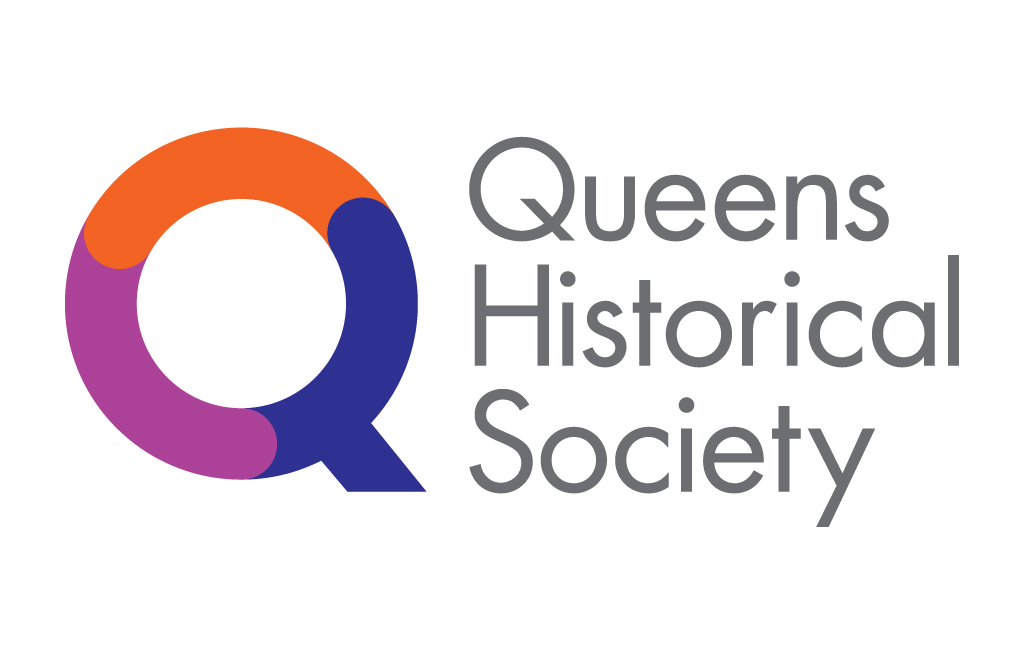
Queens Historical Soc Brand
Rich Prior Design: Queens Historical Society
I redesigned the visual identity for the Queens Historical Society in New York City. The identity was inspired by the history and location of Queens, NY. The logomark uses a color palette reminiscent of the three primary train lines that run throughout the borough of Queens. The colors are symbolic of the connection between the Queens Historical Society and Queens. The counter-clockwise direction of the logo is intentionally used to imply looking back at history. The "Q" was designed to evoke a modern "search" icon in the shape of a magnifying glass to emphasize the research of Queens' history and heritage and the Queens Historical Society's attempt to bring that information into the digital age. This is reinforced with the tagline I created as part of the brand: "Discover Queens".


