Maske Kompagniet Brand
The visual identity of the Masko Kompagniet brand. The logo and branding and story behind the design.
Kirk & Holm: Maske Kompagniet
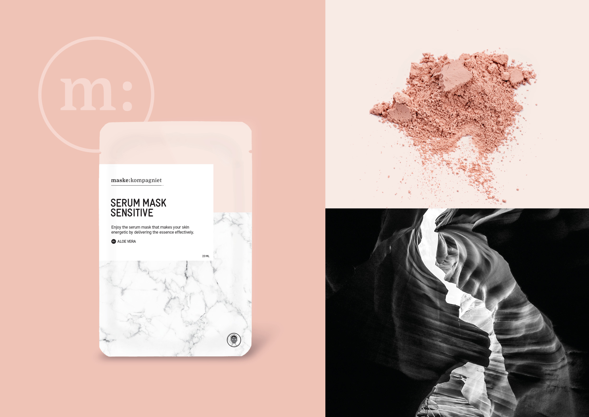
The identity design for a face masks line is very fresh, feminine and modern. The goal is to create the impression of relief and relaxation already before you apply the product.
In the concept, we’re using soft and pastel skin tones, refreshing and cold marble and contrasting black. The simple and minimalistic design is based on the idea of ”Less is more” which also applies to skin care.
The logo for maske:kompagniet has two variants, a typographical one and the symbol used as a 5th element. The serif typography makes the brand trustworthy and solid but, by not using capital letters, a modern and fresh approach is indicated.


