Innovators Expo Brand
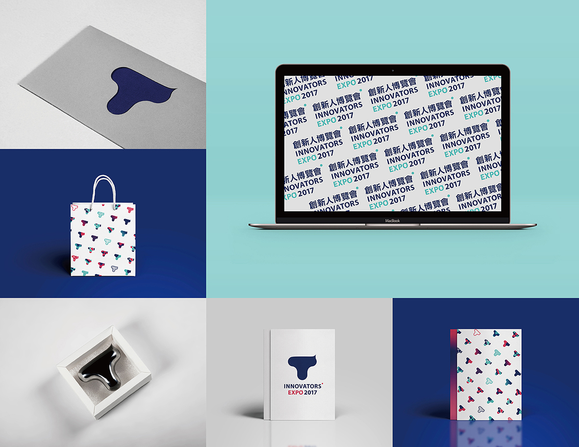
The visual identity of the Innovators Expo brand. The logo and branding and story behind the design.
Chen Ping Chen: Innovators Expo
The letter “T” not only links to various imaginations related to the Expo, but it also stands for the initial letter of its host Tunghai University. Having reviewed the works displayed, as well as the examples from the previous year, the term “innovator” does not seem to me as an implication for infinite challenges against the limits, nor for the perpetual dash towards the unknown.
Rather, it appears to indicate a steady rise and breakthrough achieved with confidence and composure, anticipating the future within the ordinary. I illustrated the logo as a letter “T” with smooth flexures in dark blue, which is one of the official colours of Tunghai University, and adorned the logo with a curvy pike.
For extended applications, I experimented with various ways to construct the silhouette of the logo, hoping to create an overall visual identity that is capable of accepting all types of imaginations as well as communicating diversity and possibilities.


